Page 23 - DIY Investor Magazine February 2018
P. 23
 Richard joined Old Mutual Global Investors as head of UK equities in June 2013, and was appointed as chief
executive in August 2015. He was previously at Schroders, where he managed the Schroder UK Alpha Plus Fund for over 10 years. Prior to Schroders he spent more than a decade at Baring Asset Management, having commenced his investment
ENTER BEAR THE SECOND
So, to the second bear; the keeper of the yield curve. With more
US interest rate rises on the horizon, short-dated bond yields, unsurprisingly, continue to rise, (although my second bear, being more of a procrastinator than the first, is unsure if UK interest rates should rise further any time soon).
Meanwhile, longer-dated bond yields, those with maturities of 10 years or more, refuse to budge. The yield curve looks decidedly flat.
So, what is the presence of this bear telling us? Traditionally, flattish yield curves have, though not always, presaged a slowdown in growth. This time round it could, of course, be different.
We know incremental rises in interest rates are a function of a return to more normal economic conditions, hence short-dated yields should be rising. But we also know that once central banks taper their bond purchases, supply will become more readily available and yields should, in theory, start to rise. So why is this not happening?
Timing is everything. Just as it has taken years of central bank largesse to kick start the global economy, similarly it could take years for this stimulus to unwind. Don’t expect bonds to yield nominal GDP (real GDP growth plus inflation) any time soon.
Of course, the counter argument to that is that bond yields could rise more sharply if we get a rogue inflation figure. Europe’s largest trade union, IG Metall, has just asked for a 6% pay rise, in recognition
of ‘excellent economic conditions.’ And, referencing growth in technology, not since the 1930s have we had such slack in the economy. But that gap could soon start to narrow and inflationary spirits be rekindled. The Phillips curve could be alive and well, after all.
60 00
2555
1000 600 400
200
100 60 40
20
career in 1985 at Brown Shipley Asset Management.
Richard was awarded the Outstanding Contribution to the Industry honour at the Morningstar OBSR Awards in 2012 and has a degree in English language and literature from the University of Oxford.
ENTER THE BULL
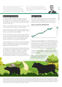
As an investor it is all too easy to obsess over short-term problems: Trump, Brexit, monetary tightening, and so on. The longer-term perspective becomes completely obscured. So to end on, here is a chart of why my story has only two bears and a rather large bull.
Long run chart of the S&P 500 Index
Source: Bloomberg as at 16 November 2017.
23 DIY Investor Magazine | Jan 2018
recipient’s individual circumstances or otherwise constitutes a personal recommendation. It is distributed solely for information purposes, it does not constitute an advertise- ment and is not to be construed as a solicitation or an offer to buy or sell any securities or related financial instruments in any jurisdiction. No representation or warranty, either expressed or implied, is provided in relation to the accuracy, completeness or reliability of the information contained herein, nor is it intended to be a complete state- ment or summary of the securities, markets or developments referred to in the document. Any opinions expressed in this document are subject to change without notice and may differ or be contrary to opinions expressed by other business areas or groups of Old Mutual Global Investors as a result of using different assumptions and criteria. This communication is for retail investors. A member of the IA. OMGI 01_18_0098.
10 1940-49 1950-59 1960-69 1970-79 1980-89 1990-99 2000-09 2010-19 2020-29
The above is an 80-year logarithmic chart of the S&P 500 index. The years 1936-1950 and 1968-1982, which mark the periods between a bull market peak and the next time the index exceeded that peak, were followed by 18-year bull markets in 1950-1968 and 1982-2000. During those periods the S&P 500 index ratcheted up gains of 400% and 1400% respectively. The last time such an event occurred was in 2013, when the S&P broke through the previous peak of 1550.
The dotted red arrow in the top right corner is a copy of the solid red arrow which marks the 1950-68 bull market. It takes us to 2031 and an index level of 8200.
Of course, there’s no guarantee that this will happen but it could just be that my story has a happy ending after all.


