
Page 29 - DIY Investor Magazine - May 2019
P. 29
For example, from 1st November 2013 to 30th April 2014 the index rose 1.0%, while during the following period 1st May 2014 to 31st October 2014 the index fell 3.2%. The difference in performance was therefore 4.2%, and that is the figure plotted on the chart for 2014 (the final bar in the chart).
The chart shows quite a remarkable thing, namely that the market seems to perform much better in the six-month winter period than the summer period. To quantify this outperformance:
• In the 33 years since 1982, the winter period has outperformed the summer period 28 times (84%).
• The average annual outperformance since 1982 has been 8.6%!
The behaviour is extraordinary and should not exist in a modern, efficient(ish) market. But exist it does. Indeed, a similar effect also exists in other markets such as the US.
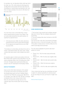
SOME OBSERVATIONS:
1. The first day of each month has the highest average daily return for the FTSE 100, followed closely by the second day.
2. The worst average daily return has been on the 20th of the month.
3 As can be seen in the chart, the periods of strongest daily returns occur in first and final weeks of the month. 4 The pattern of daily returns in months divides into five (rather surprisingly precise) phases:
The chart above highlights the positive daily return phases of a month.
• Phase 1 (1st – 6th): the index sees positive daily returns
An academic paper in 2012 found evidence of the Six- • Month Effect (also called the Sell in May Effect in the UK and the Halloween Effect in the US) starting from 1694 • in the UK. The paper also found that the effect was
present in 36 of 37 developed and emerging markets. •
Phase 2 (7th – 12th): the index sees negative daily returns
Phase 3 (13th – 18th): the index sees positive daily returns
Phase 4 (19th – 23rd): the index sees negative
DAYS OF THE MONTH
daily returns
• Phase 5 (24th – 31st): the index sees negative daily
returns
This is a book that may have you scratching your head in search of a rational explanation for what is present- ed, but one thing is for sure, you’ll return to it again and again.
www.harriman-house.com
Here we look at the historic behaviour of the market
on each day of the month; the following chart plots
the average daily returns for the 31 calendar days in
a month for the FTSE 100 over the period 1984-2015. For example, since 1984, the FTSE 100 has on average increased 0.27% on the 1st day of each month.
Note, the chart plots the average returns on the calendar days of the months rather than just trading days.
29 DIY Investor Magazine | May 2019
